Before
Dropped Into Ambiguity
What participants experienced:
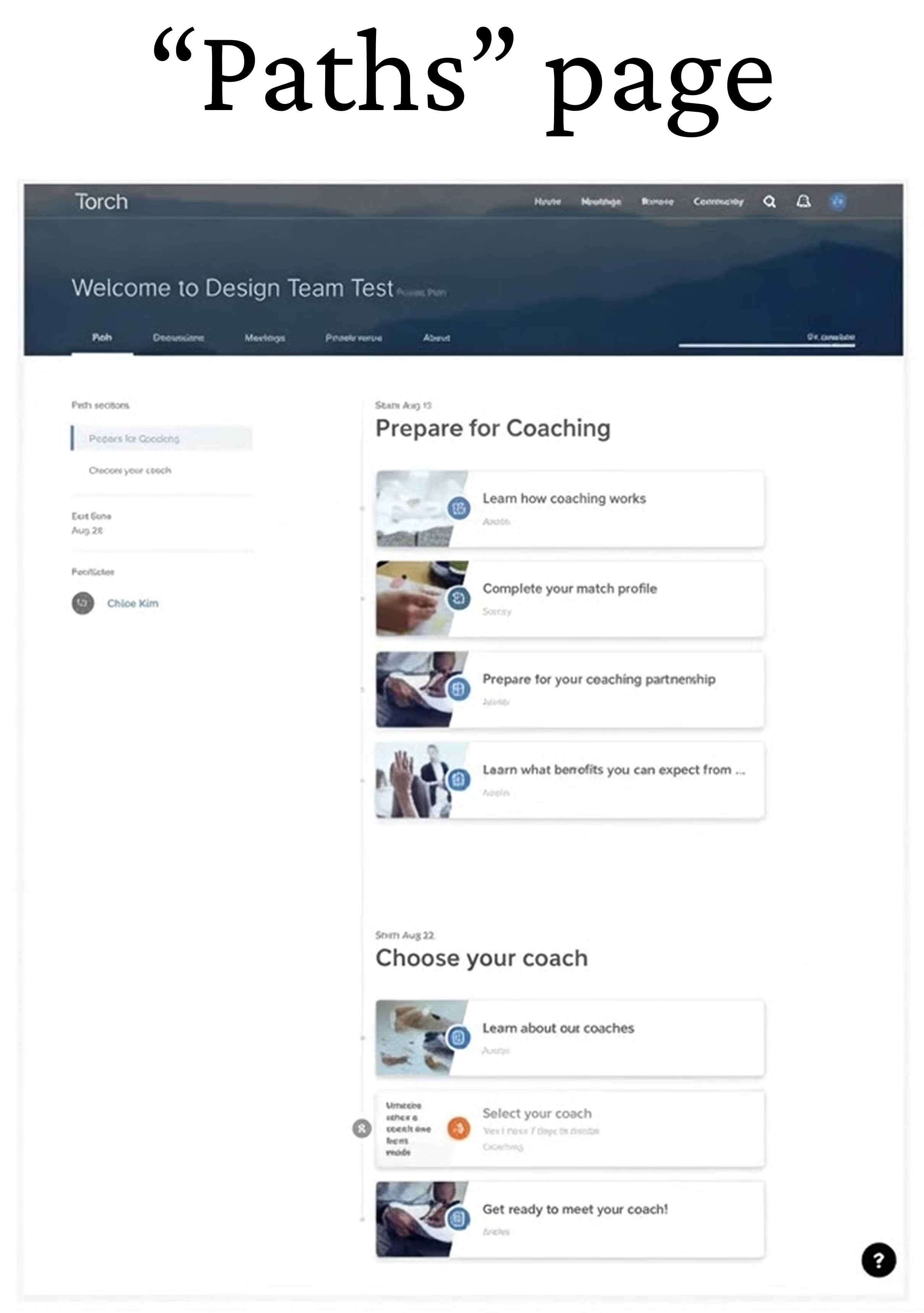
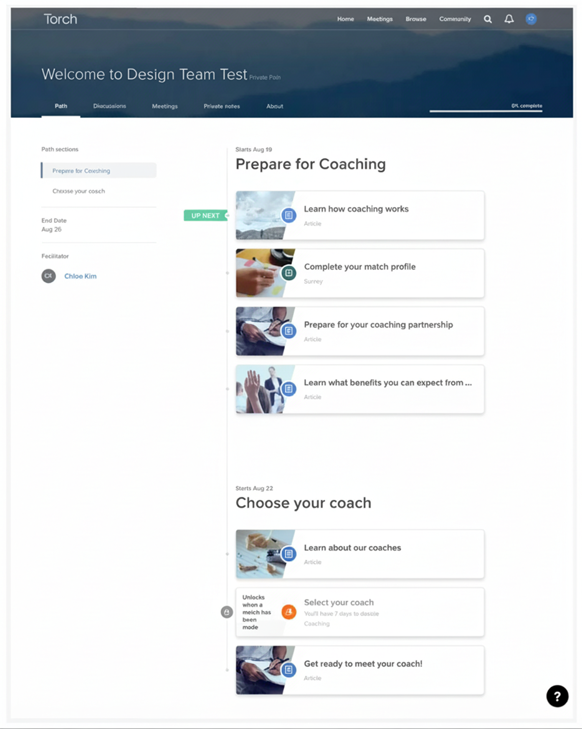
- Sign up for Torch → Immediately land on "Path" page
- See various navigation options with no guidance
- Eventually discover match profile buried in resources (key action)
- Take 1-2 weeks to complete (if at all)
Journey timeline

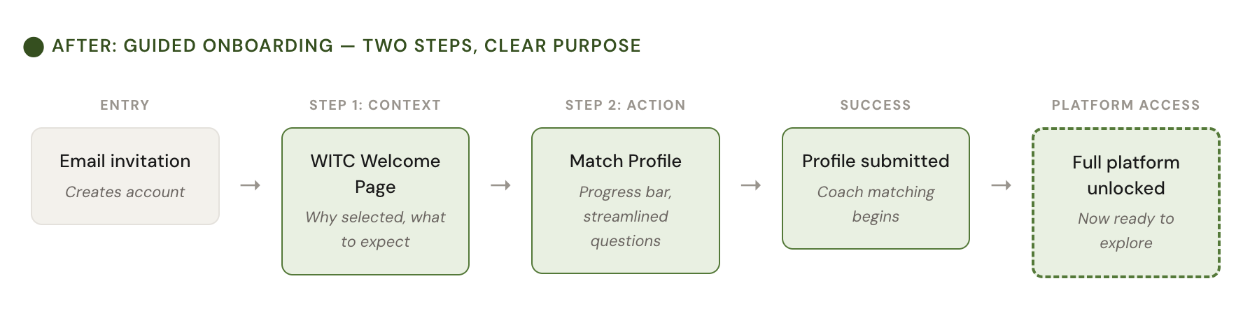
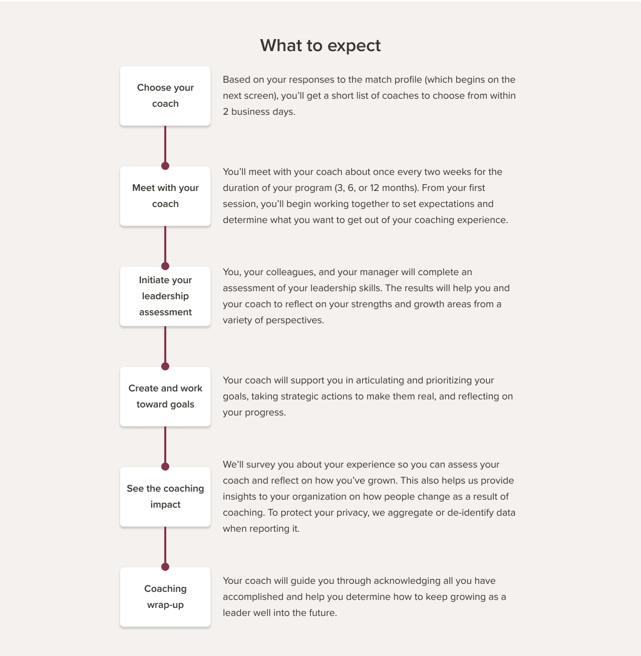
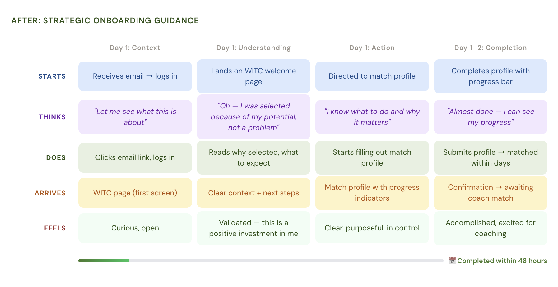
Providing Strategic Guidance
What participants NOW experienced:
- Sign up for Torch → Land on WITC welcome page
- Understand why selected, what to expect, what to do next
- Immediately directed to match profile with clear progress
- Complete within 48 hours

Journey timeline